



Verde Botanicals – Cosmetic Brand
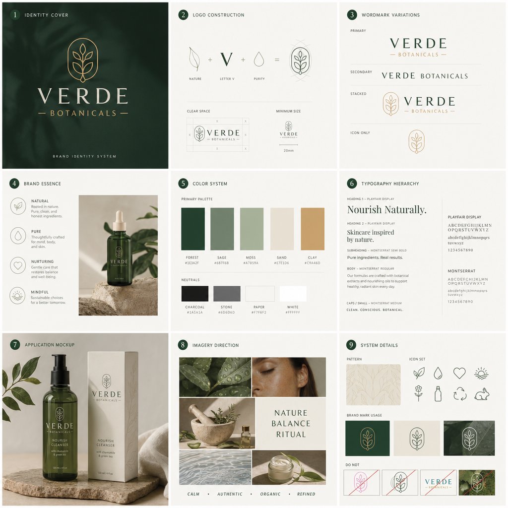
The objective of this brand identity appears to be the creation of a visual universe that feels both natural and premium. Rather than using overly decorative “organic” clichés, the design relies on restraint, balance, and soft sophistication. This makes the brand suitable for skincare, wellness, botanical cosmetics, or clean beauty products aimed at a conscious, design-sensitive audience.
Brand Strategy and Positioning
The brand is built around four clear values: Natural, Pure, Nurturing, and Mindful. These pillars give the identity a strong emotional and commercial foundation. Verde Botanicals is not positioned only as a product brand, but as a ritual-based lifestyle brand. The wording suggests care, balance, simplicity, and responsible choices.
This positioning works well because it connects functional skincare benefits with emotional reassurance. The visual direction does not feel clinical or overly luxurious; instead, it sits between premium wellness and natural apothecary. That makes the brand accessible while still preserving a high-end perception.
Logo and Visual Identity
The logo construction combines three symbolic elements: a leaf, the letter “V”, and a drop shape. This is an effective system because each element has a direct link to the brand world: nature, purity, and botanical care. The final mark is simple, memorable, and scalable.
The emblem inside the rounded vertical frame gives the brand a crafted, almost heritage-inspired quality. It feels like a seal of authenticity without becoming old-fashioned. The different logo variations — primary wordmark, secondary version, stacked lockup, and icon-only usage — show that the identity has been designed for practical use across packaging, labels, website headers, social media, and small-format applications.
The “Do Not” section is also important: it establishes clear brand protection rules and avoids common mistakes such as distortion, poor contrast, inappropriate color use, or incorrect logo placement.
Color System
The color palette is one of the strongest parts of the identity. The primary colors — forest green, sage, moss, sand, and clay — create a natural but refined atmosphere. The deep forest green gives the brand authority and premium weight, while the softer sage and moss tones add calmness and botanical freshness. Sand and clay bring warmth, preventing the identity from feeling too cold or sterile.
The neutral palette — charcoal, stone, paper, and white — supports a clean editorial layout. These shades are useful for packaging, typography, backgrounds, and digital interfaces. Overall, the palette is commercial and flexible: it can work on product packaging, e-commerce pages, social media templates, printed stationery, and retail displays.
Typography
The typography creates a strong contrast between elegance and clarity. The use of Playfair Display for headings gives the brand a sophisticated, editorial feel. It adds a sense of refinement and beauty, which is appropriate for skincare and cosmetics. The supporting use of Montserrat brings modernity, readability, and structure.
This pairing is effective because it avoids two extremes: the brand does not become too decorative, and it also does not become too generic. The typography hierarchy shown in the image is clear, with defined styles for headings, subheadings, body copy, and small caps. This makes the identity easier to apply consistently across marketing materials.
Packaging and Product Application
The packaging mockup is well aligned with the brand positioning. The dark green bottle immediately communicates botanical skincare, while the cream-colored box gives a premium and clean impression. The minimal label design allows the logo and product name to breathe, which strengthens the perceived value of the product.
The materials and setting — stone surface, soft fabric, plant leaves, and muted natural lighting — reinforce the idea of purity and ritual. The result feels calm, credible, and aspirational without looking artificial.
Imagery Direction
The imagery direction uses close-up natural textures, leaves, skin, water, herbs, and skincare rituals. This supports the brand’s message visually without needing excessive explanation. The selected images communicate calmness, authenticity, and organic care.
The image board also introduces the words Calm, Authentic, Organic, Refined, which summarize the brand’s visual language well. This is useful because it gives future designers, photographers, marketers, or social media managers a clear creative direction.
Iconography and System Details
The icon set is simple, line-based, and coherent with the logo. Icons such as the leaf, water drop, heart, sun, flower, bottle, recycling symbol, and rabbit communicate the expected values of a clean beauty brand: natural ingredients, hydration, care, sustainability, and cruelty-free principles.
The pattern system adds another useful brand asset. It can be applied to packaging interiors, tissue paper, website backgrounds, thank-you cards, stickers, or social media graphics. This gives the brand more depth while keeping the visual language subtle.
Overall Evaluation
This case study shows a complete and well-structured identity system for a botanical skincare brand. The strongest aspect is the consistency between strategy and execution: every visual decision supports the same message of natural refinement.
The identity feels premium, calm, and commercially usable. It avoids visual noise, uses a controlled palette, and provides enough flexibility for real-world applications. The brand could easily be extended into a full e-commerce website, product line, launch campaign, social media content system, retail packaging, and printed brand collateral.
In summary, Verde Botanicals demonstrates how a clean beauty brand can build trust and desirability through a disciplined visual system: a meaningful logo, elegant typography, natural colors, consistent imagery, and practical usage guidelines.
Brief & project description
- Identity Cover
- Logo Construction
- Wordmark Variations
- Brand Essence
- Color System
- Typography
- Application Mockup
- Imagery Direction
- Visuals Elements