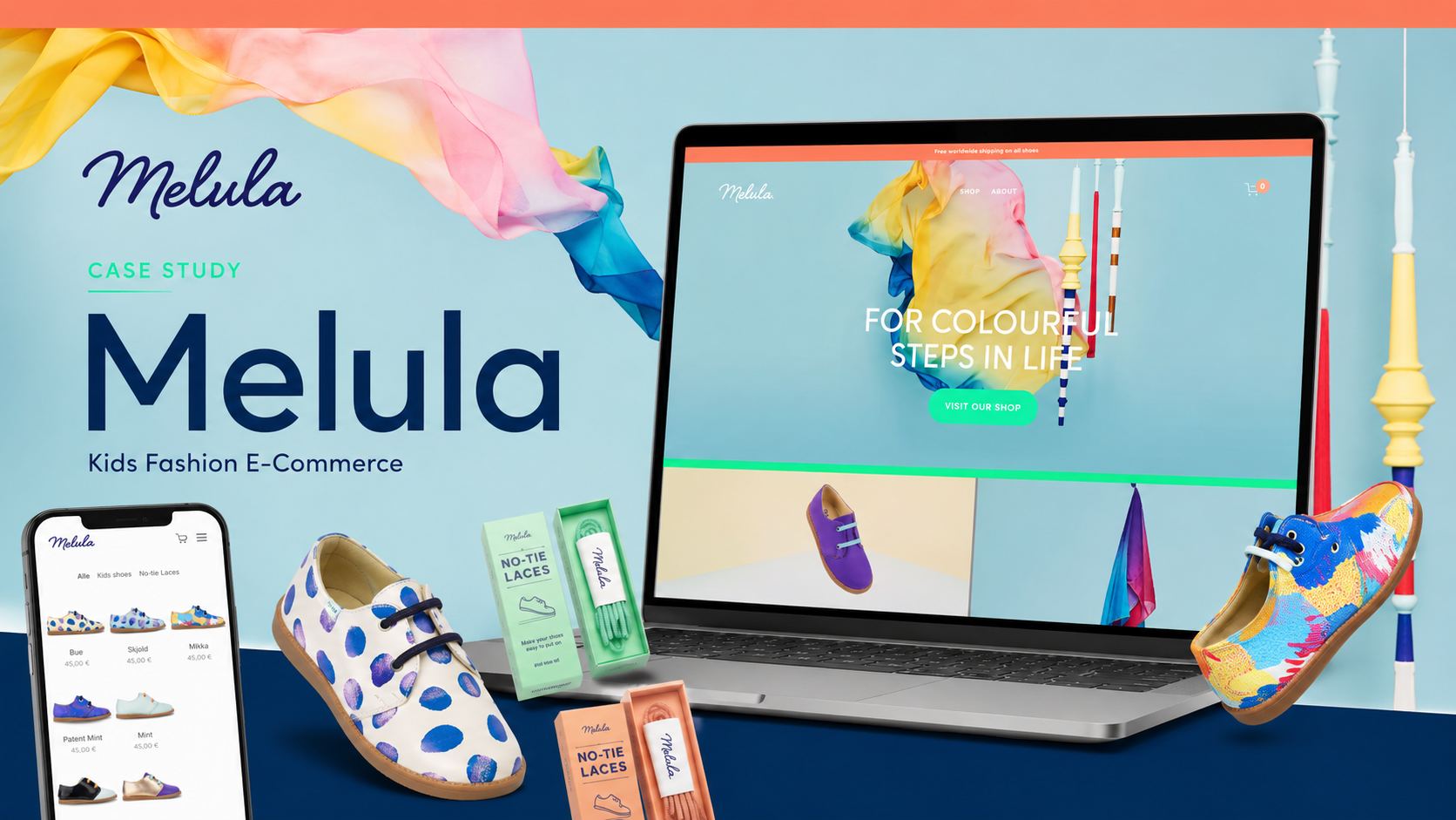
Melula – E-commerce Website
For Melula, the objective was to create a distinctive e-commerce experience that translates the brand’s playful Scandinavian identity into a clear, memorable, and commercially functional digital platform.
Melula is a Copenhagen-based children’s fashion brand focused on colourful, playful, and gender-neutral footwear. Its products are designed in Denmark and manufactured in Portugal, combining childlike expression with the simplicity associated with Scandinavian design.

Project Context
Melula was founded by Danish designers Louise Møllermark and Søren Hougesen, who joined forces in 2015 around a shared interest in simple and beautiful product design. The brand emerged from their difficulty finding children’s shoes that combined playful, child-oriented expression with Scandinavian visual restraint.
This positioning shaped the digital brief.
The website could not feel like a generic children’s footwear shop. It needed to preserve the contrast at the heart of the brand:
simple forms, expressive colours, practical construction, and playful personality.
That balance became the foundation of both the visual system and the content hierarchy.
Strategic Challenge
The central challenge was to create a website that felt imaginative enough for a children’s brand while remaining refined enough to support Melula’s design-led positioning.
Children’s fashion websites often fall into one of two extremes:
- highly decorative interfaces that become visually noisy;
- overly minimal fashion stores that lose warmth and personality.
For Melula, the digital experience needed to sit between those two models.
The platform had to communicate:
- visual originality;
- Scandinavian restraint;
- product quality;
- comfort and durability;
- gender-neutral design;
- ethical production;
- European craftsmanship.
At the same time, the purchasing journey needed to remain straightforward. Visitors had to move easily from brand discovery to product browsing, selection, cart, delivery information, and purchase.
Brand Positioning
The website positions Melula around the line:
“For colourful steps in life.”
This short statement works as both a product promise and a brand philosophy. It connects footwear with movement, childhood, creativity, and colour while avoiding conventional gendered messaging.
The wider brand proposition is built around four principles.
Playful Scandinavian design
Melula combines strong colour choices and distinctive shapes with a clean Nordic visual language. The brand draws inspiration from the creative processes of children and the way they express themselves through play.
Gender-neutral expression
The footwear is designed with a unisex approach whenever possible, allowing colour and form to lead the product identity rather than traditional gender categories.
Everyday versatility
The shoes are positioned as transitional footwear suitable both for more styled occasions and everyday use. This gives the products a broader functional role than purely decorative children’s fashion.
European production quality
The brand emphasizes production in Portugal, with materials sourced mainly from Portugal, Italy, and Spain. This supports a premium narrative around craftsmanship, durability, and supply-chain transparency.
Information Architecture
The website uses a deliberately compact information architecture:
- Home
- Shop
- About
- Cart
- Contact & Wholesale
- Shipping & Returns
- Terms and Conditions
This simplicity is appropriate for a focused direct-to-consumer brand.
Rather than distributing information across numerous editorial pages, the platform concentrates attention on three primary journeys:
- discovering the brand;
- browsing and purchasing products;
- understanding the story and production values.
This reduces cognitive load and keeps the customer journey direct.
Homepage Experience
The homepage acts primarily as a brand introduction rather than a dense product grid.
Its opening message establishes the emotional territory of the brand before directing visitors toward the shop. It then introduces Melula as a Copenhagen-based children’s fashion label that is colourful, playful, gender-neutral, designed in Denmark, and produced in Portugal.
This sequencing is strategically useful.
Instead of presenting products without context, the website first gives users a reason to care about the brand. The user then moves from:
brand promise → design identity → product discovery → social proof → community engagement.
The homepage also includes press visibility, Instagram integration, and newsletter registration, creating several trust and retention layers beyond immediate commerce.
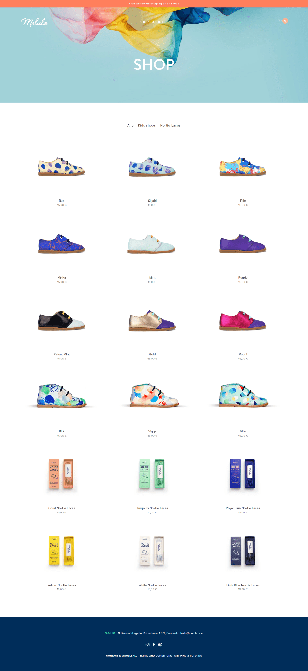
E-commerce Structure
The shop is organized around two principal categories:
- Kids shoes
- No-tie laces
The product catalogue presents individual models such as Bue, Skjold, Fille, Mikka, Mint, Purple, Patent Mint, Gold, Peoni, Birk, Vigga, and Ville, alongside coloured no-tie laces. Shoes are listed at €45, while the laces are listed at €10.
From a commercial perspective, this creates a focused product structure.
The main footwear line establishes the core transaction, while the lace category introduces a lower-priced accessory product that can support:
- basket expansion;
- colour customization;
- replacement purchases;
- repeat engagement;
- gifting.
The limited category structure also prevents unnecessary navigation complexity. Users are not forced through deep collection hierarchies or excessive filtering for a relatively curated range.
Product Naming Strategy
One of the more distinctive brand decisions is the use of short, memorable product names rather than purely descriptive titles.
Names such as Bue, Skjold, Fille, Mikka, Vigga, and Ville create a recognizable product family and reinforce the brand’s Scandinavian character.
This naming strategy contributes to the site in several ways:
- it makes individual models easier to remember;
- it supports editorial storytelling;
- it creates brand-owned terminology;
- it avoids reducing products to colours or functional descriptions;
- it gives the collection a more designed and collectible quality.
For a small fashion label, that distinction is important because memorability can compensate for a more limited product range.
Visual Direction
The website’s visual identity is built around the same tension as the products: clean structure combined with expressive imagery.
The design avoids heavy interface decoration and instead lets photography, colour, shapes, and typography carry the brand personality.
This approach supports Melula’s positioning because the products themselves are visually distinctive. The digital interface does not need to compete with them.
The result is a system in which:
- whitespace creates refinement;
- large imagery adds energy;
- limited navigation keeps the experience calm;
- bright product colours deliver the playful element;
- simple typography maintains Scandinavian clarity.
Storytelling and Brand Depth
The About page is central to the project because it gives substance to the visual identity.
It explains:
- who founded the company;
- why the brand was created;
- how children’s creativity informs the design process;
- how the shoes combine playfulness and simplicity;
- why comfort and mobility matter;
- where the products are manufactured;
- how suppliers and materials are selected.
This content transforms the brand from a visually appealing shop into a more credible design business.
For parents, the purchase decision is rarely based on aesthetics alone. The story must also answer practical and ethical questions:
- Will the shoes be comfortable?
- Are they flexible enough for movement?
- Are the materials durable?
- Where are they produced?
- Is the production process responsible?
The About page addresses these concerns directly.
Product Quality and Material Communication
Melula explains that comfort and quality are core product requirements. The brand uses soft materials and a supportive internal construction intended to stabilize the ankle while remaining flexible enough for movement. The products are also described as breathable, durable, and easy to clean.
From a conversion perspective, this content is important because children’s footwear purchases involve a higher degree of functional scrutiny than many fashion accessories.
The website therefore balances two kinds of value:
emotional value, through colour and design;
practical value, through comfort, flexibility, breathability, and durability.
This dual narrative helps reduce hesitation and positions the products as both visually original and suitable for real everyday use.
Ethical Production Positioning
The brand places significant emphasis on transparent and fair production.
Melula states that it works only with manufacturers operating under transparent conditions, ethical guidelines, fair working practices, and environmental standards. Its principal shoe manufacturer is based in mainland Portugal and comes from a historical shoemaking tradition focused on children’s footwear.
The supplier network is also geographically coherent. Textiles come from Portugal, while leather materials are sourced from Italian and Spanish suppliers.
This production story adds credibility in three areas:
- craftsmanship;
- quality control;
- responsible sourcing.
For a European design brand, communicating this information is particularly valuable because it differentiates the products from anonymous mass-market alternatives.
International Commerce
The website supports global delivery.
Melula ships within Europe through Danish postal services and GLS, while private carriers are used outside Europe. The company states that it delivers worldwide, with typical European and international transit times of approximately five to seven business days after dispatch.
The returns policy allows new and unused goods purchased through the website to be returned within two weeks, in line with the stated European withdrawal period, provided packaging and labels remain intact.
These pages are more than administrative content. They form part of the conversion infrastructure by answering key questions for overseas buyers:
- Is delivery available in my country?
- How long will it take?
- Can I return the item?
- What condition must the product be in?
- Where is the company located?
Clear shipping and return information is especially important for children’s footwear, where sizing uncertainty can be a significant source of purchase hesitation.
Wholesale and B2B Strategy
The site includes a dedicated Contact & Wholesale pathway, allowing retailers and commercial partners to request information about products and distribution.
This gives the platform a dual commercial function.
B2C
Direct product sales to parents and gift buyers.
B2B
Wholesale lead generation for boutiques, concept stores, and children’s fashion retailers.
The wholesale pathway is intentionally simple, directing prospects toward direct contact rather than creating an overly complex trade portal.
For a focused design brand, this approach can be effective because it preserves a personal sales process while still making the opportunity visible.
Social and Community Strategy
Instagram, Facebook, and Pinterest are integrated throughout the website, with Instagram receiving particular emphasis on the homepage.
These channels are especially relevant to Melula because the brand is highly visual.
They support:
- product styling inspiration;
- collection launches;
- customer-generated content;
- retail discovery;
- design storytelling;
- brand awareness beyond direct search.
Pinterest is also well aligned with children’s fashion, gift discovery, colour inspiration, and parent-focused planning behaviour.
Email Acquisition
The homepage includes a newsletter registration form inviting users to receive news and updates.
Although simple, this creates an important owned-marketing channel.
For a seasonal fashion brand, email can support:
- new collection launches;
- restock notifications;
- limited-edition releases;
- wholesale news;
- editorial storytelling;
- repeat purchases;
- accessory promotion.
This reduces dependence on social platforms and gives the brand a more direct relationship with its audience.
Conversion Strategy
The website follows a relatively concise conversion funnel:
Discover the brand → understand the design philosophy → browse the shop → select a product → add to cart → review delivery conditions → purchase.
Secondary conversion paths include:
- subscribing to the newsletter;
- following social channels;
- reading the brand story;
- submitting a wholesale enquiry.
The homepage CTA, simplified navigation, product-focused shop, and persistent cart access all support this direct structure.
Technical and Functional Structure
The platform combines the essential components of a small international fashion e-commerce site:
- responsive brand presentation;
- categorized product catalogue;
- product imagery;
- pricing and stock status;
- shopping cart;
- international shipping information;
- returns documentation;
- newsletter capture;
- social-media integration;
- wholesale contact pathway;
- legal and commercial pages;
- brand storytelling;
- press and social-proof content.
The technical structure remains intentionally lightweight, matching the scale and curated nature of the catalogue.
UX Assessment
The website’s greatest UX strength is its focus.
It does not attempt to imitate a large marketplace. Instead, it uses a limited number of pages and product categories to create a more controlled, editorial experience.
This supports several benefits:
- fast orientation;
- strong brand recall;
- limited navigation friction;
- direct access to the shop;
- clear distinction between brand and commerce;
- easier maintenance for a small collection.
The trade-off is that the site relies heavily on imagery and concise product presentation. For customers requiring extensive sizing, fit, care, or material information, richer product-level detail could further strengthen purchase confidence.
Marketing Value
The platform provides Melula with a unified channel for brand building and commerce.
Its value lies in its ability to:
- establish a recognizable Scandinavian design identity;
- communicate a gender-neutral philosophy;
- sell directly to international customers;
- explain craftsmanship and responsible production;
- build trust through founder storytelling;
- support accessories and product customization;
- attract wholesale partners;
- grow an email audience;
- connect social discovery with purchase;
- maintain a focused premium presentation.
Outcome
The resulting website acts as both a digital flagship and a direct-sales platform.
It translates Melula’s core philosophy—colourful, playful, simple, and responsibly produced—into a compact and coherent online experience.
The user journey can be summarized as:
Discover the visual identity → understand the brand story → explore the collection → evaluate quality and production → purchase or make contact.
The platform therefore supports Melula not only as a footwear retailer, but as a design-led children’s fashion brand with international consumer and wholesale ambitions.

Key points of the project
- Design-led children’s fashion website
- Scandinavian brand positioning
- Direct-to-consumer e-commerce
- Accessory and customization pathway
- Founder and mission storytelling
- Materials and comfort communication
- Ethical production narrative
- European craftsmanship positioning
- Worldwide shipping information
- Instagram, Facebook, and Pinterest integration
- Scalable fashion-commerce foundation
