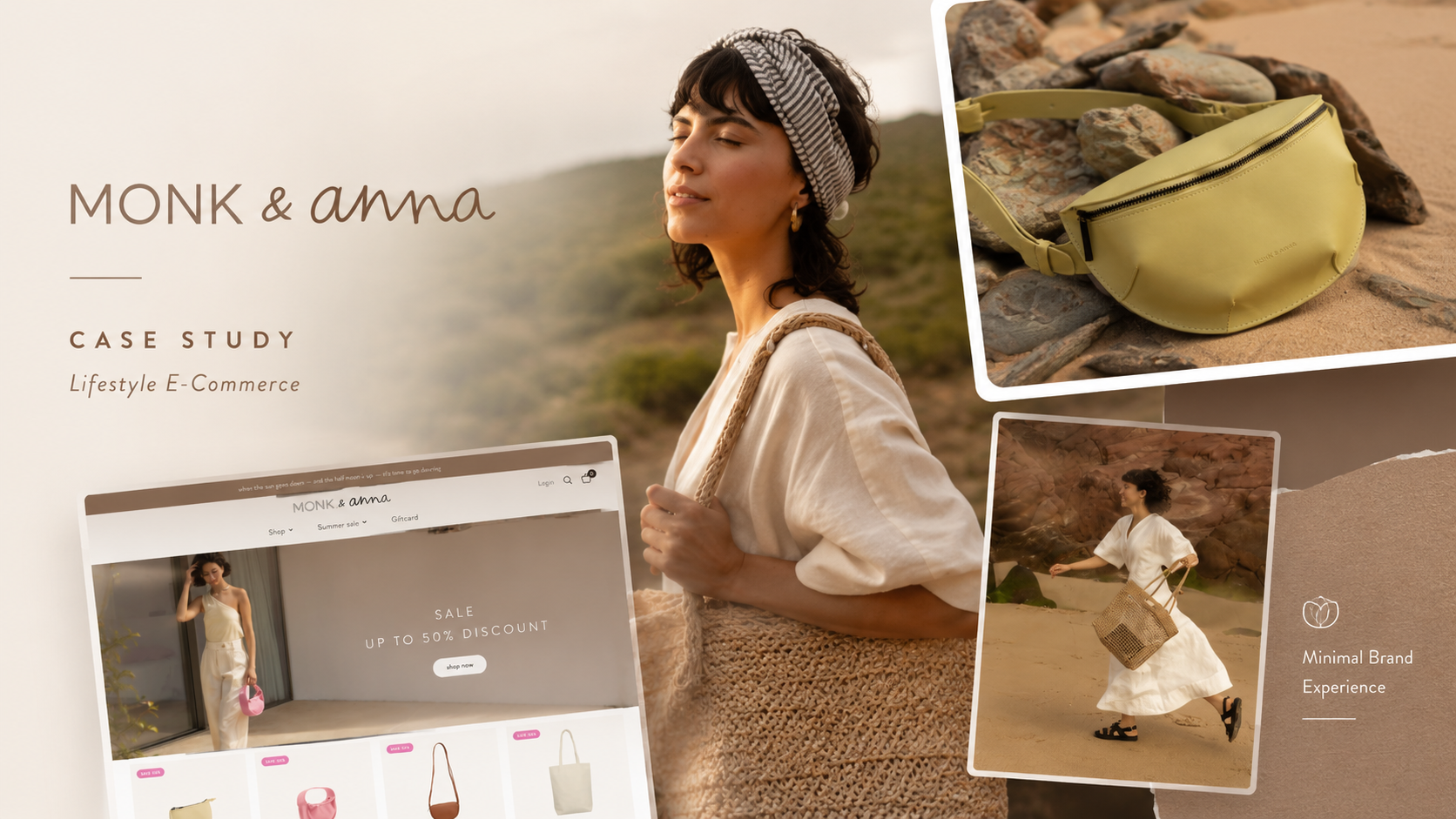
Monk & Anna – Bags & Fashion E-commerce
For Monk & Anna, the objective was to create a refined lifestyle e-commerce platform that could translate a highly distinctive product universe into a clear, scalable, and commercially effective online experience.
The brand does not operate as a conventional accessories store. Its offer spans bags, jewellery, stationery, home objects, socks, natural soap, yoga essentials, gift products, and seasonal edits. Each collection is designed around soft colours, tactile materials, minimal forms, and carefully named products with their own story. The website therefore needed to support both product discovery and brand immersion, while remaining simple enough to guide customers efficiently toward purchase.

Project Context
Monk & Anna was founded in 2016 by three creatives who wanted to make products they personally loved. The brand name originates from the old King Kong film: “Monk” refers to King Kong, while “Anna” references Ann from the story. What began with the first Monk bag and Anna shopper has developed into a broader lifestyle collection covering accessories, clothing-related products, jewellery, and stationery.
This background gave the project a strong narrative foundation. The digital platform had to communicate more than product utility. It needed to express a coherent creative world inspired by:
- Japanese aesthetics;
- nature;
- fashion;
- craftsmanship;
- soft, earthy colour palettes;
- contrasting textures;
- understated everyday objects.
The website therefore had to behave as both a retail interface and a digital extension of the brand’s design philosophy.
Strategic Challenge
The principal challenge was to maintain the brand’s calm, minimal identity while presenting a surprisingly broad and commercially complex catalogue.
Monk & Anna sells multiple product families, including:
- backpacks;
- belt bags;
- cross-body bags;
- handbags;
- phone pouches;
- shoulder bags;
- shoppers;
- toiletry bags;
- wallets;
- headwear;
- jewellery;
- socks;
- natural soap;
- yoga essentials;
- notebooks;
- pencil cases;
- home accessories.
Without a strong information architecture, this variety could easily create a fragmented shopping experience. The website needed to make the offer feel curated rather than crowded.
A second challenge was balancing editorial storytelling with conversion. Monk & Anna’s products rely heavily on mood, material, colour, naming, and presentation. A purely transactional store would weaken the brand, while an overly editorial experience could make shopping unnecessarily slow.
The strategic solution was to create a restrained commerce structure where visual storytelling, category discovery, product detail, and purchase actions are integrated rather than separated.
Brand Positioning
Monk & Anna is positioned as a minimalist lifestyle brand with an emotional and narrative product language.
Its identity is built around small collections, carefully considered objects, subtle details, individual packaging, and products that each carry their own name and story. Product names are also linked to the brand’s King Kong inspiration, creating a consistent internal naming system rather than relying only on generic product descriptions.
This approach gives the brand several advantages:
- stronger product memorability;
- a more collectible feel;
- a coherent creative universe;
- differentiation from generic accessories retailers;
- greater potential for editorial storytelling.
The digital experience needed to preserve that distinctiveness while making every item understandable and purchasable.
Information Architecture
The website’s primary shopping structure is organized around four principal commercial families:
Bags
This includes backpacks, belt bags, cross-body bags, handbags, phone pouches, shoulder bags, shoppers, toiletry bags, and wallets.
Accessories
The accessories section includes headwear, home objects, jewellery, natural soap, socks, and yoga essentials.
Jewellery
Jewellery is given its own dedicated layer, with bracelets, earrings, and necklaces separated into clear subcategories.
Stationery
The stationery range includes notebooks, pencil cases, and other smaller objects.
This structure is appropriate because it accommodates a wide assortment without forcing users into a deep or technical product taxonomy.
The navigation also gives dedicated visibility to promotional routes such as seasonal sales, gift guides, and gift cards. These are not treated as secondary footer links; they are integrated into the main commerce experience to support seasonal conversion and gifting behaviour.
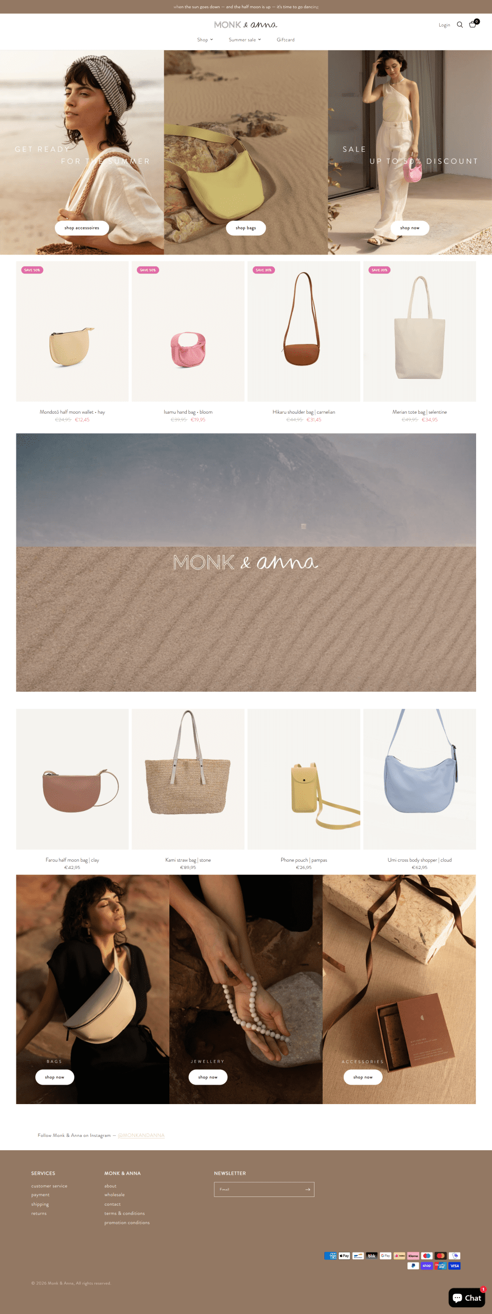
Homepage Strategy
The homepage acts as a curated visual entry point rather than a complete product catalogue.
Its main functions are to:
- introduce the current brand mood;
- direct visitors toward major product categories;
- highlight seasonal promotions;
- surface selected products;
- guide users toward bags, jewellery, and accessories;
- connect the store to Instagram;
- capture newsletter subscriptions.
The site uses prominent category imagery and limited copy to maintain a calm visual rhythm. This gives the product photography enough space to carry the brand while preserving clear commercial entry points.
The homepage also mixes full-price discovery with promotional merchandising. Products can be surfaced with visible savings of 30% or 50%, allowing the brand to communicate value without redesigning the entire store around discount messaging.
Product Discovery Strategy
The product architecture supports several shopping behaviours:
Category-led discovery
Users who know what type of product they want can navigate directly to a specific bag, accessory, jewellery, or stationery category.
Visual browsing
The brand’s materials, colours, and forms are highly visual, so product imagery plays a central role in discovery.
Promotional shopping
Sale collections are divided by product family and discount level, helping price-sensitive customers find relevant products quickly.
Gift-oriented shopping
Gift cards and curated gift edits create dedicated pathways for customers shopping for someone else.
Product-name recognition
Distinctive product names make it easier for returning customers to recognize or search for specific items.
This multi-path structure is important because the brand attracts both intentional shoppers and more exploratory, design-led visitors.
Product Page Experience
The product page combines visual presentation with practical purchase information.
For example, the Mondotō half-moon wallet page includes:
- multiple product images;
- sale pricing;
- product variants;
- add-to-cart functionality;
- material details;
- size specifications;
- product-care instructions;
- a short product story;
- contextual information about Monk & Anna.
The wallet is described as being made from recycled vegan leather, with checked cotton lining and a YKK zipper. The page also explains how to clean the product and advises against machine washing.
This structure supports both emotional and rational purchase decisions.
The product story creates character, while the technical information reduces uncertainty around:
- size;
- construction;
- material;
- care;
- price;
- intended use.
That balance is especially important for tactile lifestyle products that customers cannot physically inspect before buying.
Storytelling System
One of the strongest aspects of the brand is the consistency between its corporate story and its product language.
The About page explains that each collection begins with research into colour palettes and textures. The creative team then develops the range through inspiration drawn from everyday life, Japan, nature, fashion, and craftsmanship.
This process has been translated into a website that communicates through:
- muted palettes;
- natural tones;
- carefully controlled whitespace;
- tactile product photography;
- poetic promotional copy;
- individual product names;
- short product narratives.
The storytelling does not rely on lengthy editorial content throughout the shopping journey. Instead, it is distributed across the brand story, product naming, campaign lines, packaging references, photography, and product-page details.
Visual and UX Direction
The visual strategy is intentionally restrained.
Rather than using loud promotional graphics or dense commercial layouts, the interface allows texture, shape, and colour to define the experience.
The principal design characteristics include:
- generous whitespace;
- soft neutral backgrounds;
- understated typography;
- earthy and muted product colours;
- editorial image cropping;
- simple navigation;
- minimal interface decoration;
- clear product cards;
- low-friction cart access.
This aligns the website with the products themselves: functional, quiet, detailed, and aesthetically considered.
From a UX perspective, the restraint also improves product visibility. The interface does not compete with the merchandise, which is particularly important for a brand whose distinction lies in subtle colour and material differences.
Commerce and Conversion Strategy
The conversion journey is straightforward:
Enter through a collection or campaign → browse a category → open a product → review details and imagery → select a variant → add to cart → checkout.
The platform supports this with:
- persistent cart access;
- customer login;
- search;
- clear sale pricing;
- category-level navigation;
- visible product availability;
- multiple payment methods;
- service information for shipping and returns.
The payment environment includes a broad selection of methods such as Apple Pay, Google Pay, PayPal, Klarna, Bancontact, iDEAL, credit cards, and regional payment options. This is useful for an international European customer base because it reduces checkout friction caused by limited payment choice.
Promotional and Seasonal Merchandising
Seasonal merchandising is integrated directly into the architecture.
The website can support:
- spring or summer sales;
- archive sales;
- percentage-based sale collections;
- category-specific discount pages;
- gift guides;
- festive edits;
- gift cards.
The current navigation includes dedicated discount paths such as 30% and 50% sale collections, allowing the brand to segment promotions without compromising the presentation of the full-price catalogue.
This modular approach allows merchandising teams to adapt the homepage and navigation according to the retail calendar while keeping the core design system intact.
Gift Strategy
Gift cards and curated gift edits expand the platform beyond self-purchase.
For a lifestyle brand selling accessories, jewellery, stationery, and smaller personal objects, gifting is a natural revenue channel.
The digital structure supports this through:
- a dedicated gift-card page;
- gift-guide navigation;
- seasonal edits;
- lower-price accessory categories;
- visually distinctive product packaging;
- products with individual stories and names.
This allows customers to shop according to occasion or recipient, rather than only by product category.
Newsletter and Retention
Newsletter capture is integrated into the site footer, providing the brand with an owned retention channel.
For Monk & Anna, email marketing can support:
- new collection launches;
- colour and material stories;
- seasonal edits;
- sale announcements;
- gift guides;
- product restocks;
- retailer news;
- editorial brand content.
Because the brand releases small, curated collections, email is particularly valuable for creating anticipation and driving repeat visits without relying exclusively on paid or social traffic.
Social Commerce and Instagram
Instagram is prominently connected to the store through a direct invitation to follow @MONKANDANNA.
This channel is strategically aligned with the brand because Monk & Anna’s appeal is highly visual.
Instagram can extend the website experience through:
- lifestyle photography;
- product styling;
- material close-ups;
- seasonal colour palettes;
- retailer features;
- behind-the-scenes product development;
- collection launches.
The website therefore functions as the transactional centre, while social channels act as ongoing discovery and inspiration layers.
Wholesale and B2B Acquisition
The platform also supports wholesale expansion.
A dedicated wholesale page invites retailers to contact the brand and learn more about sales conditions. Wholesale enquiries are routed through the brand’s commercial partner, Rilla go Rilla.
This creates a dual commercial model:
Direct-to-consumer
Customers purchase directly through the e-commerce platform.
Business-to-business
Independent boutiques and lifestyle retailers can enquire about carrying Monk & Anna products.
The wholesale journey is kept intentionally simple. Rather than requiring a complex trade registration system, the site uses a direct contact-based approach suited to a curated design brand where retailer relationships may require individual evaluation.
Brand Consistency Across B2C and B2B
The wholesale pathway benefits from the same digital brand presentation as the consumer store.
Retail prospects can evaluate:
- product variety;
- visual identity;
- category depth;
- pricing position;
- campaign direction;
- seasonal collections;
- packaging philosophy;
- brand story.
This means the consumer-facing site also acts as a digital showroom for potential stockists.
The website therefore contributes to wholesale conversion even before a retailer reaches the contact page.
Customer Service Architecture
Customer-service information is structured into dedicated areas for:
- customer support;
- payment;
- shipping;
- returns;
- contact;
- terms and conditions;
- promotion conditions.
This improves trust by keeping operational information easy to locate.
For international e-commerce, these pages are essential because customers need reassurance about payment methods, delivery, returns, and promotional rules before completing a purchase.
Technical and Functional Structure
The platform combines the principal components required for a scalable lifestyle-commerce operation:
- multi-category product catalogue;
- nested product taxonomy;
- product variants;
- sale pricing;
- customer login;
- persistent shopping cart;
- product search;
- gift-card sales;
- seasonal merchandising;
- product-care content;
- material and size information;
- newsletter capture;
- social integration;
- wholesale contact routing;
- multi-method payments;
- legal and promotional documentation;
- responsive commerce navigation.
The platform appears to use a Shopify-based commerce structure, reflected in its checkout-related functionality and payment ecosystem. This supports product management, discounting, inventory, customer accounts, and payment integration within a scalable retail environment. This is an inference based on the site’s visible commerce structure and payment options.
UX Assessment
The website’s main UX strength is its ability to make a broad lifestyle range feel coherent.
This is achieved through:
- a limited number of top-level product families;
- consistent visual direction;
- controlled copy density;
- repeated naming conventions;
- strong category imagery;
- compact product descriptions;
- easy access to promotional collections.
The result is a shopping experience that feels curated rather than inventory-driven.
The main strategic trade-off is that such a restrained visual system depends heavily on excellent photography, accurate product details, and strong filtering as the catalogue grows. If the assortment continues to expand, faceted filtering by colour, material, size, price, and availability could become increasingly valuable.
Marketing Value
The website provides Monk & Anna with a unified platform for brand building, direct sales, retention, and wholesale growth.
Its primary marketing functions are to:
- communicate a recognizable creative identity;
- organize a broad product portfolio;
- support seasonal campaigns;
- generate direct e-commerce revenue;
- increase gifting opportunities;
- capture newsletter subscribers;
- connect Instagram discovery with purchase;
- attract independent retailers;
- reinforce product quality through detail and care information;
- build long-term brand recognition through naming and storytelling.
Outcome
The resulting platform positions Monk & Anna as a coherent lifestyle brand rather than a collection of unrelated accessories.
It turns a varied catalogue into a consistent digital world built around:
- soft colour;
- tactile materials;
- minimal forms;
- named products;
- personal stories;
- thoughtful everyday objects.
The customer journey can be summarized as:
Discover the brand world → explore a product family → connect with a product’s material and story → review practical details → purchase or engage with the brand.
For retailers, the platform supports a parallel journey:
Discover the collection → assess the brand and product range → evaluate retail fit → submit a wholesale enquiry.
The website therefore functions as a digital flagship, e-commerce store, product catalogue, campaign platform, and wholesale showroom.

Key points of the project
- Lifestyle-led e-commerce platform
- Minimalist brand positioning
- Multi-category product architecture
- Bags and accessories taxonomy
- Jewellery and stationery discovery
- Product naming and storytelling system
- Editorial product presentation
- Seasonal sale architecture
- Gift-guide and gift-card pathways
- Product variant management
